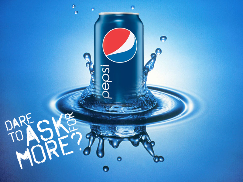
Pepsi, yup, I am a Pepsi girl true blue am I. I live in Pepsi land, this is where it all started out, here in a little town called New Bern, NC, just 30 minutes from me. They even have an iconic Pepsi store where you can actually buy a Pepsi for less than a buck. Go figure! It is real. I have lived in Pepsi land for over 30 years now and when looking for an ad to take apart, here it was. I searched various sites and came across one called Deviant Art, which has lots of art and ads in it, and this one, just screamed at me, “here am I, pick me!” So I did. We will delve into the reasons one by one as we tackle the topics as follows: contrast, repetition, alignment, proximity, and color. Each one is relevant and as we search them, I hope you can see why I am a Pepsi girl through and through.
Contrast

In this ad, the yellow boxes delineate the object through the contrast of light and dark areas. With the bright light coming from behind, this makes the can pop out in a 3-D effect and wakes you up. Bright white and light blue create the contrast with the dark bubbles under the can reinforcing the contrast and 3-D effect. White lettering is also popping out from the dark blue areas and creates a soothing, refreshing feeling, like water. We notice that the colors are clean, cool-looking, like the drink intends us to think and the text is interesting. You would think it would fight the look but it does not and the contrast between the cool blue and the clean white is solid. The iconic logo, like the flag, sits solidly on the can and one immediately recognizes what they are looking at.
Repetition
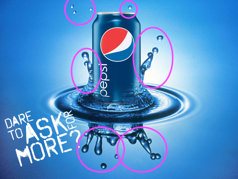
Repetition is something we see over, and over, and over again which creates a cohesive element to this ad. I really like how they use the strong look of splashing bubbles that stand out from the can. They spray up, out, and downwards. They are giving you that “energizing feeling” that makes you want to run to the fridge and grab a cold one of these. These bubbles do not hide the logo or get in the way, instead, they gravitate you to the can itself. To what you know is inside, something with pop and fizz. We learn that with repetition we should get an organized feeling and create unity for the design.
Alignment

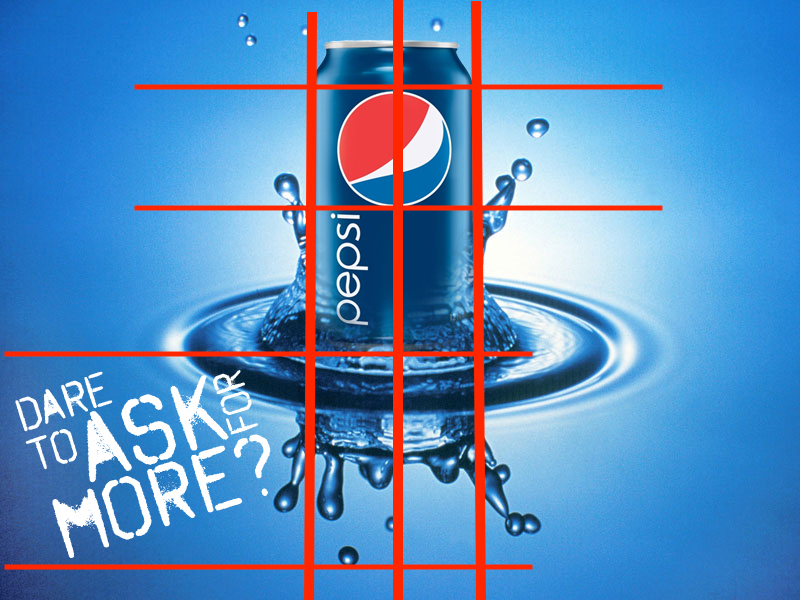
Alignment gives a sense of purpose to this ad. The text is strongly placed in the bottom left of the ad, giving us a dramatic font and look that keeps us looking at it, while it connects to the bottom of the drops that appear to spread out from the can being in the splash circle. It is not so far from the can that we get any disconnect. As well, it ties right into the word Pepsi on the lower left of the can. Corner font dares to ask the question that is actually answered by the name on the can. Very clever if you ask me. The alignment of the can to the water is strong and upright. This can ain’t goin’ anywhere but up. Everything feels like one unit. I absolutely love the clean lines. The bubbles going directly below the can creates another strong layer to the alignment.
Proximity
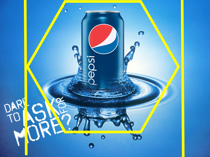
Proximity is really thoroughly being used in this ad. All elements connected to the can of Pepsi are close to one another, there is nothing extra in this ad. It is clean and filled with purpose. There is no unnecessary text, no extra that would clutter up the ad, it has clean lines and as we say down here in the south, it is straight-talking, straight from the hip. Since you know I am a Pepsi girl through and through, you know I like this ad. I like the fact that the can seems to be floating out of the water with cleanliness, and the ripples around it are close even though you know ripples extend far beyond the initial impact. That can was set down with force, deliberately on that puddle of water, and darn if the splashes didn’t just gang right on up that can and create that beautiful look of a refreshing drink. This ad is organized, and all was done with deliberate purpose.
Color
What is more eye-catching than color? I adore color and yet, this ad is not replete with any odd, eye-popping color, now is it? Nope. The logo: red, white and blue gives us that feeling of connection to America, the great. The blues are soft yet strong. If you notice, I placed the straight lines going top to bottom, because there is a subtle shift in the blues from the lines to the edges. The color deepens as it goes towards the outside edges which creates movement. The lighter colors surrounding the can bring it out into the foreground while making it pop even more because of the lack of color going on around it. This makes the splashes more exciting and the dark blue of the can is repeated in the splashes and the vortex ripple around the bottom of the can. The simple use of repeating the same colors of blue and white and only having the red from the logo on the can is indicative of strength and unity. This can has it all.
Conclusion
I want to end by saying how much I enjoyed looking at that can of Pepsi. That ad was fun. It seems so connected to itself and not worried about what others think about it. I like the fact they did not clutter up the page with extraneous items or unnecessary text. It makes me want to reach out and guzzle it right down, and I don’t drink a lot of soda. Learning how to recognize the elements that pull an ad out of the doldrums of non-existence and into the realm of reality is fun. Basically, contrast, repetition, alignment, proximity, and color are all used to create a cohesive unit that is enticing to us. Advertisers are constantly striving for new looks, quirky sayings, funky ads, and on the outrageous side, while this ad just takes all the basic elements and places them in a setting that just works. I like this ad and how it makes me want to reach out through the screen, tilt back in my chair, and pour it down this dry throat of mine. Way to go Pepsi. See, told you I was a Pepsi girl at heart: and I don’t lie!
