The magazine, Wildlife in North Carolina, January-February 2020 is studded with amazing photographs taken by folks in my neck of the woods. That made it even more special to me- “peek-a-boo”, do you see what I see?
Today, for class, I am going to explore typography and photography at the same time. I picked this article to dissect because it said, “I see you” so let’s get to it!
But wait, right off the bat, I have to say, I have tried to give credit where credit is due but I might have made some errors and of course, all ideas, thoughts and well, you know the drill, are totally mine so any “wrongs” there come back to land on me!
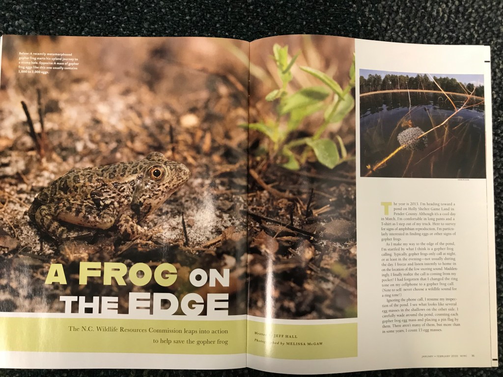
Typography is referring to the design of the letters while font tells us which typeface is being used. The whole purpose is to create a feeling and image to provide a connection to the photo and the general information on the page. I have outlined in red one font style and in blue the other one. Our readings for class suggest that it is harder to read words in all caps and with this being all caps I wanted to see if that really held true. I don’t know. I know that I was able to read it just fine. I think the difficulty came to me on the fact they used two different sizes to make the words Frog and Edge to become prominent and I had to work hard on getting that into my brain while wondering why they didn’t go a little smaller on the other words. They were just too close in size to make it work for little ole me.
contrasting typeface
In our readings we were told to look at size, weight, structure, form, direction and color. You know, it’s kind of crazy how the eye looks at things and just automatically registers what is being done. The words in the red box are all caps, right, but then on reflection, the words A, FROG, EDGE are all one size and ON and THE are another. Unfortunately, this is not a great idea because it’s almost what the readings referred to as “wimpy” as they are just too close in size. They should have had a bit more contrast to really stand out. Also, they used color on the A, FROG and different color on the rest. This was actually a little disturbing because my mind went to the other words in white and I passed over what the article was about, the frog, whose words were in a color that almost blended into the background (for me).
The weight of the type is also something to consider. We know the article is focusing on the frog simply due to the weight on the type by being heavy, all caps, and using color. The fact that the lead is in caps and the information is not does give balance to the structure. And, as our reading tells us yet again, by having the title in caps and the info in lower case we have a contrast of form. Oh the joy knowing they have created consistent contrast with their use of color, weight, structure, form, and direction. All the words are uniform in this area, creating a pleasing visual.
Looking at the typeface within the red box. This font is bold, all caps, and has no serifs involved in the letters. It appears to be a Sans Serif typeface as the letters themselves are all uniform and have no visible thick/thin on any edges of the letters.
Looking now at the blue box we see that there are serifs in the letters. They are all uniform in thick/thin lines and appear to have curlicues (otherwise known as serifs) on the letters. This means that there is contrast between the two typefaces. Reading the typeface in the blue box was easy on the eyes.
Knowing the difference in typefaces allows for visual variety without creating what the book called “twitchy” reactions. I know what I like, and what I don’t like, but learning why I might have that reaction was pretty nifty.
a rule to live by or break?

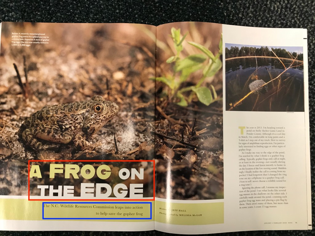
Photography is next. Rule of thirds they call it, what a great idea. It forces us to look at how we take our photos and what we deem the focus. This particular rule can help you take more interesting photos by not always using the center as your focus and breaks a photo into grids giving the photo nine equal weighted parts. The idea behind working with the grid lines gives you a guideline to producing a different kind of composed photograph. It gives the eye something to search for instead of lighting immediately on the center image. This frog sits on the back and bottom end (in the lower left quadrant) of the photo. The eye is almost centered but just enough off to be of interest to the viewer, as I felt (he, she or it) was looking right at me. This balance comes from the frog in sharp focus and the background out of focus with the plant in the upper right corner also being out of focus, but having enough color to balance out the rest of the photo. This photo makes us center on the frog even though it appears camouflaged by its surroundings. I do love a nature photo, the subjects are just so fun to look at. (Okay not a fan of bugs, just have to put it out there)
in an aside: if you are interested in learning more about the rule of thirds, there are many sites to explore but I found this to be really fun while being informative at the same time. https://timhillphotos.co.uk/rule-of-thirds/
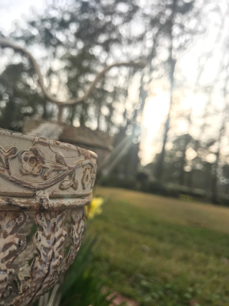
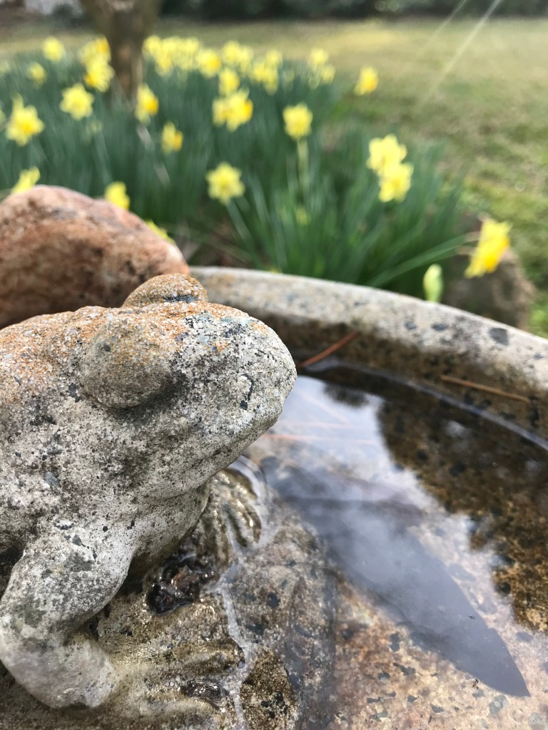
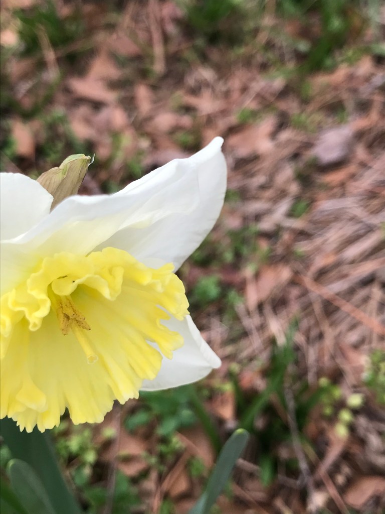
alternate images to replace the frog “on the edge”
summarizing the usage of alternate images
Why can these images replace the original frog image you ask? Because they all use the rule of thirds, locating all the subjects in the lower third, or at least the left side quadrants. Each photo stands alone yet they all have the same rule applied to them. Note that nothing is smack dab in the center. They are all just enough off to create a sense of balance even though they are slightly “centered” off center, if that makes any sense. Your eye finds this appealing while your senses are heightened because there is something about the photo that says, ” I am different”. I think the fun is in trying to capture the same idea but using a different approach. All of these could have been accomplished with putting the main focus in the center but then they would not stand out. By putting them off on the side, they have a little more interest to capture the viewer. There is power in alternative image capturing. Nature is awe inspiring and trying to capture it takes patience and a willingness to look at something from a new perspective.
Doing this whole project made me realize how little I paid attention to typeface, never realizing that what I was reacting to were all the things the book calls “twitchy”. Do not be a wimp was my favorite phrase from the book. Breaking rules is fine as long as you understand what rule you might be breaking and make sure you know why you are doing it. Whether you are doing this with typography or photography. Knowing your different typography selections can help create better projects and I find myself double looking at things, restaurant menus, posters, ads, etc. with a more discerning eye, one that tries to see what the idea is behind the message. What? Really? Yes, what and really!
Composition in photos is fun to play with and working within the grids was something that I have always striven for …though…sometimes using the center image is really fine. You have to know what you want to achieve, what your image is to portray that will guide you in this rule of thirds. Lastly, it is knowing why you are doing it that counts, so go ahead, break the rules, just know to be successful, you have to understand them first.
In the end, it is all about understanding what is going on, the impression you are going after, when to push boundaries, and how to accomplish your mission. Enough said.
