Every day you wake up and have to figure out the outfit. Well, I am here to tell you to stop, forget it, just get comfortable and create your style of today by wearing those comfy, well-worn jeans no matter where you go. Today, they go anywhere you go. Lots of companies have come into the program. You can get them at just about any store. If you want them to last, you want quality, and if you want to be fashionable all at the same time, then head on over to Madewell. They have got you covered: literally! Their materials, their dedication to quality, and their customer service is as good as it gets, if not better. I love my Madewell’s. They even, yippee for me, you and them, have teacher discounts on top of discounts! Score and win! So, go on over to their side and see what you can find!
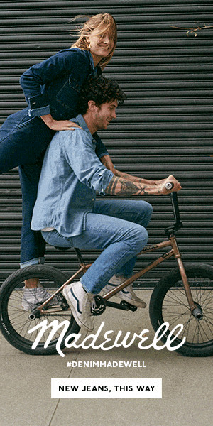
Below, a random ad that I did NOT use but found appealing as well. Just something for you to look at before we jump into the actual assignment. See the joy? Makes you like them right away.
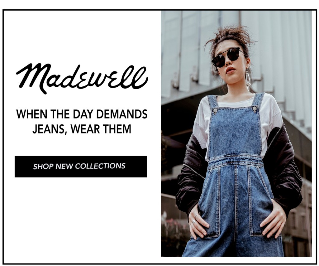
Madewell AD campaign by me for you!
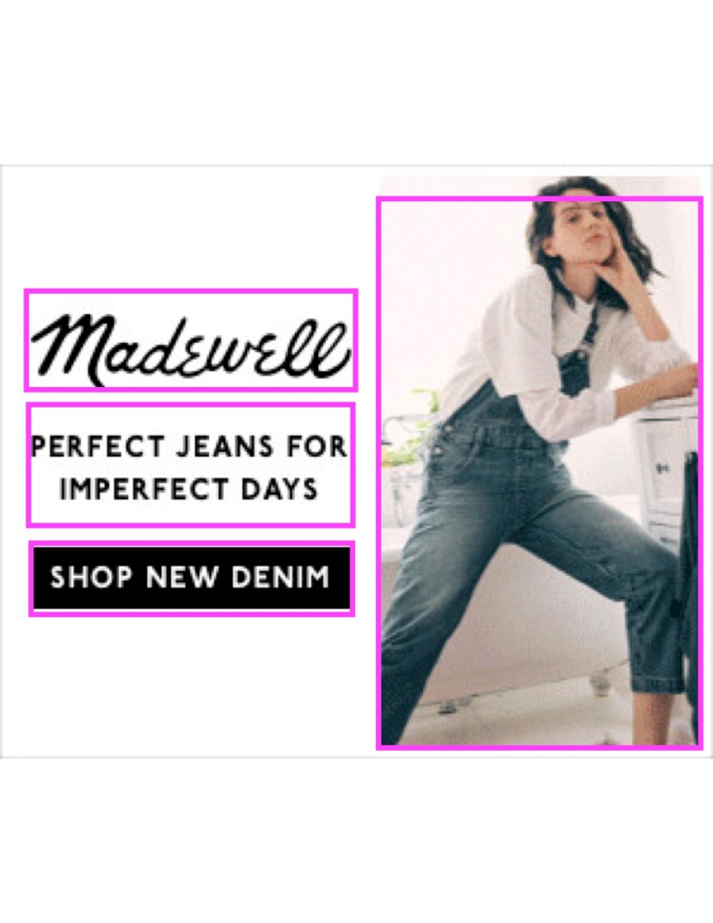
I invite you to take a look at one ad that has a feel for living life. I loved this ad. I got it from https://moat.com/advertiser/madewell?report_type=display and I approve this ad (sorry, it is election year, I could not stop myself).

Design principles, or something like that!
Another class assignment here, please bear with me on this one. IN this section we will be discussing the basic design elements that make up this ad. They are all something we talked about before with the frog so this should not be something new to you. Let me know if you agree with my assessments and if not, why not.
BELOW:
CONTRAST, PROXIMITY, REPETITION, ALIGNMENT are all elements in this ad that we can address. It has a basic contrast in using very little color. White and black. Natural opposites help to make the photo shine and for the jeans to be a point of reference. Now the proximity comes from the equal spacing of the whole ad. The type is evenly spaced and there is a nice border going around the photo. The repetition comes in the type and the colors being used. This is a very neutral look. There is alignment in that all the type line up in fine order on both the sides of the Madewell logo. The photo has the same alignment as the type in the “up/down” portrait mode.
Below:
This is my take on the ad from above. The same design elements are in place. The ad is vertical while being in a rectangle. Contrast came from the neutral colors of keeping the background similar and with the colors of the type being the same black throughout. Proximity is obtained by keeping everything aligned and with the wording being equal distance within the box as well. The alignment was obtained by keeping the type boxes aligned with the beginning and end of the logo, once again. Repetition was again done with the colors. Jeans are yet again the focal point.


TyPoGraPhY: above and below
Once again, let’s compare the two ads with their typography. Basically, the logo was imported from them so that stayed the same. The informal type used for the logo is very familiar and feels very homey and comfy. Like them. The logo is really distinguishable to anyone that knows this brand. This company likes to take the time to say they “know you” and your needs. This logo typography makes you feel like they do. It looks like old-style handwriting and that gives you peace and you trust this brand right off the bat. They used a basic font of Copperplate for the rest of the text. When they use the tag line, “Perfect jeans for imperfect days” they admit to having days that just don’t go your way. They feel ya. They can relate. This font is in direct contrast by not being a script, having sans-serif, and being very practical and clean looking. I find this compliments the ad to perfection. The call to action, to shop, is said clearly without shouting it at you. You don’t feel bamboozled into shopping here. You trust instead.
I kept the typography on the same level as the original ad. I used a basic font called Avenir-heavy, as a comparison to the script of the logo. Spacing was also a part of it. I may have “reworded” the text but I feel this says the same thing. It calls you to pay attention to how you feel and don’t be embarrassed or shy about wanting to don those really, very comfy jeans, for any time of day or night. The call to action is saying the same thing just using different words and alerting you that there might be more than what you see by using the word “collections”.

COLOR/BACKGROUND:
above (original) and below (mine)
So let’s attack both ads at once here. They are both outlined in black to note the talking about color and background. You might be wondering out of all the fun ads out there, why pick this one and I have to tell you. I love Madewell. I truly think they have a superior brand and I like their stuff. This ad was a favorite of mine for the basic simplicity of color and lines. I love that it didn’t try and come at you with a ton of things. It told it like it was-“Look for us, we got you covered, we got your jeans.” I liked the clean look of the white background. The way the types contrasted on the white background. The way the script and the sans-serif were a perfect match. This is sophistication at a comfortable level. One I can relate to. Can you?
I would like to give credit where it is due so below are the links from where all my work came from. Thank you to the world of the internet that made it all possible.
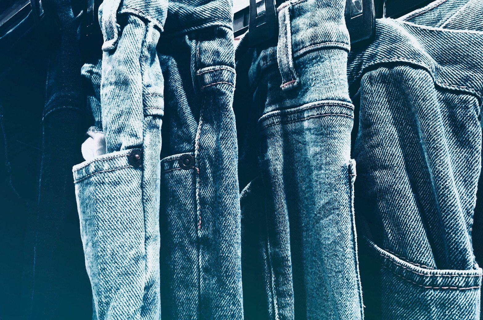
The feature photo link: https://www.pexels.com/photo/blue-jeans-close-up-cloth-denim-pants-603022/utm_content=attributionCopyText&utm_medium=referral&utm_source=pexels
The original ad for Madewell: https://moat.com/advertiser/madewell?report_type=display This was not a huge one, so this looks pixeled because I blew it up.
The photo I used for my creation of the duplicate ad: Photo by Dmitriy Ilkevich on Unsplash where you can find the most generous and amazing photos of all time.
Madewell logo was taken from a google search for png free downloads.
And I used photo shop to try my best to work this like it should be worked.
Shout out to my tutor as well Alyssa, because without her, man this class would have really kicked my butt, so thank you, Alyssa. You dah bomb baby!
